WELCOME TO
|
Well, it was graphic design, and now it's typography. Typography is basically making the text say something about what it's trying to convey. We also learned about some design principles, which helped us make things look better. This was very useful because as you can see by my blog, I suck at design. We learned about Contrast, Repetition, Alignment, and Proximity. Each type has a personality. Ever heard that before? Yeah, me neither. I guess it means that every font conveys something, like a mood. Yeah. I have low IQ. Here is the stuff I did! TYPEFACE COMPARISONOk, first assignment. I guess this was okay. We needed to use a bunch of phrases with different fonts. There was Serif with the feet things, Sans Serif which is just serif without the feet, Monospace which is the characters taking up the same space, Script which is handwriting, and Display which is decorative. The ones on the bottoms are the font names. That was fun. 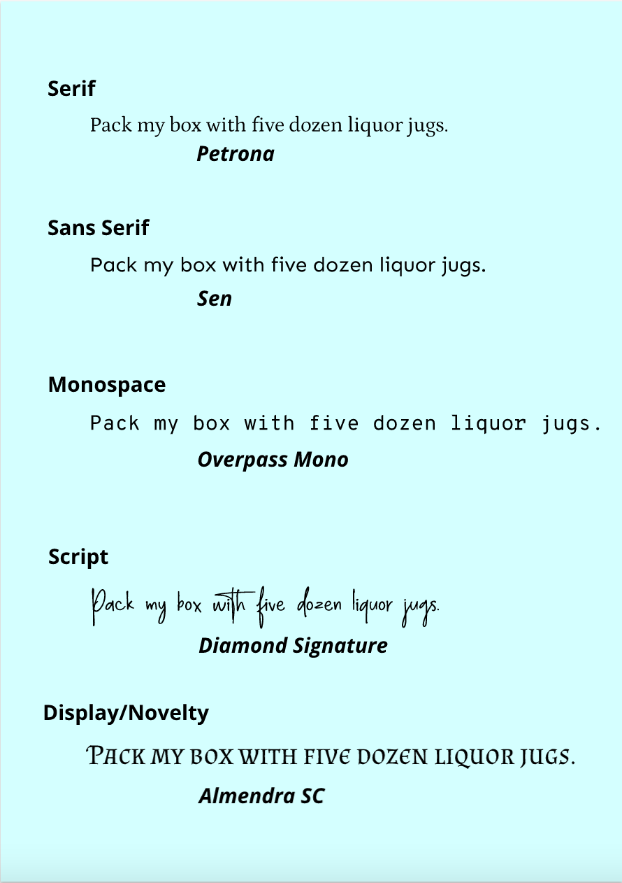 Word PortraitsSecond assignment. This one was fun. We needed to come up with a few words that accurately went good with the font... yeah. I'm so done with everything at this point. 
0 Comments
|
Who wrote this?Just some guy posting his design assingments. Archives
April 2022
Categories
All
 This work is licensed under a Creative Commons Attribution-NonCommercial-NoDerivatives 4.0 International License. |
 RSS Feed
Photo used under Creative Commons from John Brighenti
